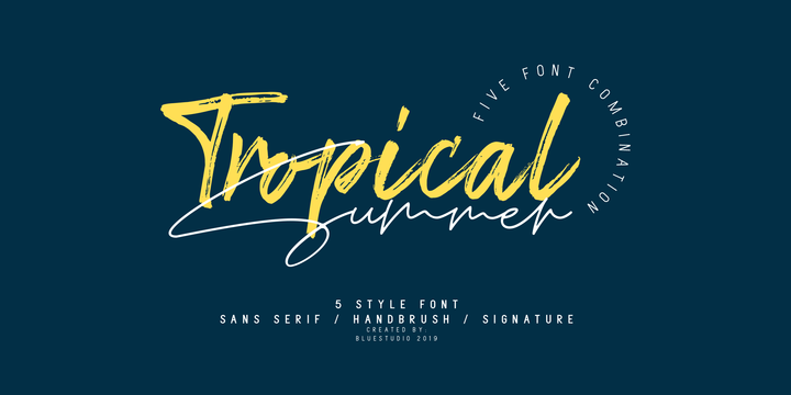
Tropical Summer is perfect combination of five fonts all your design project needs. Get inspired by its classy appearance!
Download Ludema Font Family From JAM Type Design
Download Notetaker Font Family From Corien’s Handwritingfonts
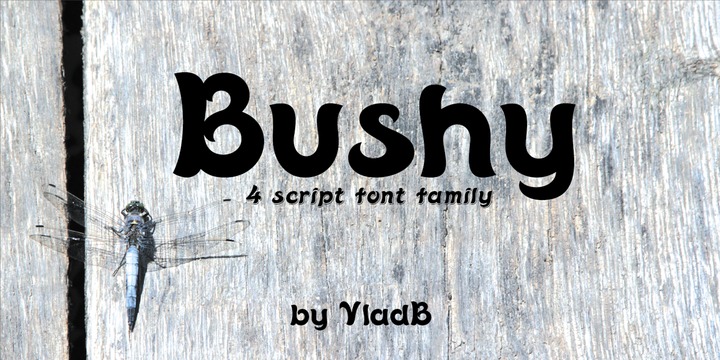
Download Bushy Font Family From VladB
Bushy family is a clean and lining brush scripts. It is available with four different styles: Regular, Italic (Oblique), Shadow, Shadow Italic (Oblique).
Bushy fonts are swashy and decorative, fun and cheerful, it will easily revive your design.
The family has an Latin Supplement and Cyrilic characters.
Download Marchello Font Family From madeDeduk
August 25, 2019
baseball
,
baseball script
,
bold fonts
,
bold script
,
classic script
,
classy fonts
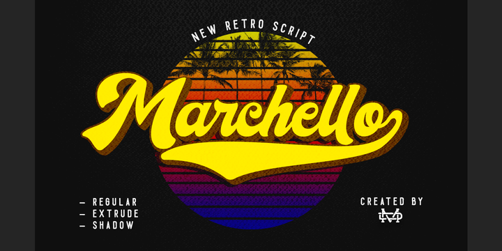
Marchello simply amazing with Regular, Extrude & Shadow styles, so you can save much time for create design. Marchello inspired from retro style 70's and perfect for poster design, book covers, merchandise, fashion campaigns, newsletters, branding, advertising, magazines, greeting cards, album covers, and quote designs and more.
Feature
- UPPERCASE
- lowercase
- Number & Symbol
- International Glyphs
- Alternative lowercase
- Ligature
- Swash
If you need anything else please contact : dedukvic@gmail.com
Download Whitley Font Family From Arendxstudio
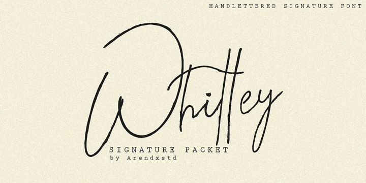
Whitley is a handwritten signature font package with a personal charm. With a style that I feel is the first time being blended with a different brush so it has a natural hand.
It includes Whitley Alt weights which have alternative characters, both with capital letters and small that is completely new.
Ligatures are available for some lowercase letters (more natural double letters). This can be accessed through software with different devices or glyph panels, e.g. Photoshop / Illustrator.
Download Overbold Font Family From Catharsis Fonts
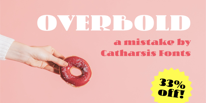
Overbold is an unapologetic display typeface inspired by an illustration in Eric Gill's Essay on Typography (p.51), in which he demonstrates «how not to make letters». In particular, he shows that increasing the weight of the downstroke in a serif «A» without structural adjustments yields an absurd, «overbold» result. I found the letter so charming that I decided to blatantly disregard Gill's wisdom and draw an entire overbold typeface. Here is the result. I'm not sorry.
Subscribe to:
Posts
(
Atom
)