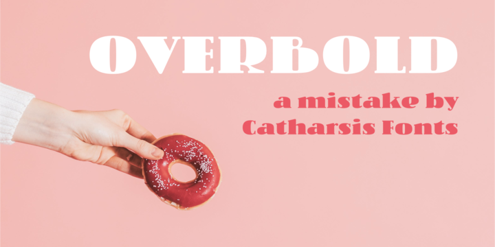
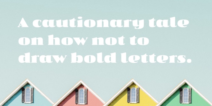
Overbold is an unapologetic display typeface inspired by an illustration in Eric Gill's Essay on Typography (p.51), in which he demonstrates «how not to make letters». In particular, he shows that increasing the weight of the downstroke in a serif «A» without structural adjustments yields an absurd, «overbold» result. I found the letter so charming that I decided to blatantly disregard Gill's wisdom and draw an entire overbold typeface. Here is the result. I'm not sorry.
Showing posts with label Music. Show all posts
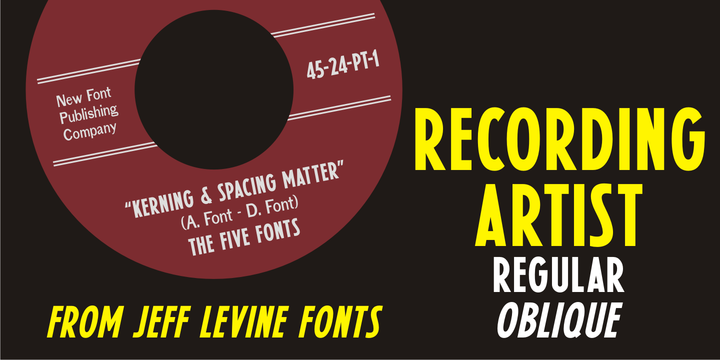
Download Recording Artist JNL Font Family From Jeff Levine
When 45 RPM records were the norm for a teenager’s music collection in the 1950s and 1960s, many discs had their labels printed by letterpress. Some record companies utilized a bold, condensed typeface set in all caps for the song’s title and other pertinent information.
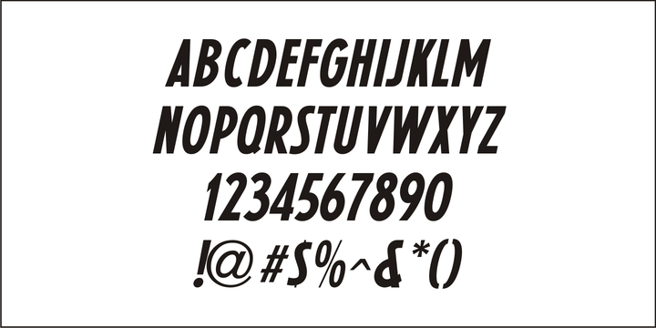
The digital version of this font is called Recording Artist JNL, and is available in both regular and oblique versions.
A companion font loosely based on this type design [but with more original characters and a slightly lighter weight] is Promotional Copy JNL.
Subscribe to:
Posts
(
Atom
)